Temple Mural (Poseidon)

Hello! Today's task was to create a sculpted relief mural for the Temple within the game (without any actual sculpting!). The Greek God Poseidon was to be represented within the context of our game.

The idea was to project a height map of Poseidon into a wall (a textured plane) and create the illusion of a sculpture using normal maps and displacement.

In order to create a height map, a digital painting needed to be made in Poseidon's image (with the desired pose and assets), so references needed to be collected. 

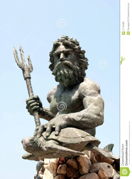
The following image was the primary reference used, since there is a strong visual impact, and a strong focus on the face of Poseidon along with the Turtle he is clutching. For the context of the game, since sheep are the primary pawn, the digital painting would have Poseidon clutching a sheep rather than a turtle.

Keeping in mind the painting needed to be done for a height map projection, that meant the parts of the painting that needed to come forward the most (such as Poseidon's arm, his hand and the sheep) needed to have the lightest values. (Height maps are based on values. Black values have no height information, whilst the lighter the value the higher the height). 

Below is the result of my digital painting. 

Now, as this is a base colour map it contains too much brushwork information to be used as an appropriate height map, and the borders are far too sharp as well. So, using bitmap2material, I generated the maps I needed. (Height, normal, AO, roughness). 
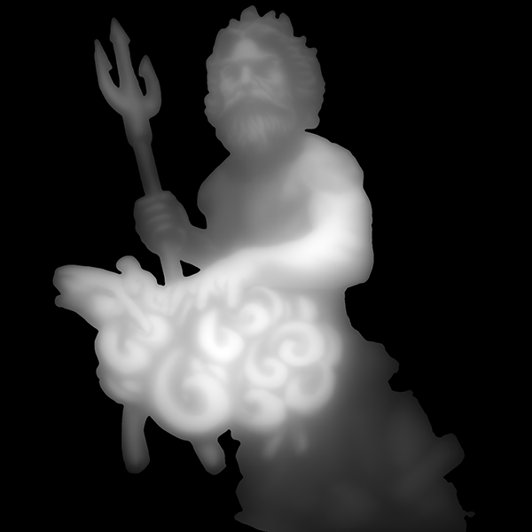
Here was the resulting height map:

As you can see above, the height map was successful in terms of the values on Poseidon. The Sheep and Poseidon's arm are clearly lighter than the rest. However, the values are very blurry especially surrounding Poseidon, which lowers the definition of the projected sculpt. 
When projected onto a textured plane (along with normal, AO and roughness maps) in Substance Painter 2, here is the result.

The map is somewhat successful, as the image is clearly projected, however the borders are too blurred, especially around the sheep's head. Taking the angle and camera distance with which the game is viewed, this would be too difficult to distinguish. 

So, I took the map into photoshop and edited the edges to produce the following height map:

Now the edges are crisper, we can take this into Substance Painter and see the result it gives us.

As you can see, the difference is small but the edges are far more defined, and the overall shapes are more visible. Now it's ready to be brought into the game and edited in the Unreal material editor!

Thanks for reading, until next time. 

Staying Grounded

So we had a bit of a problem with Kyon's Sprint ability. The problem lie in that Kyon was capable of launching off of slight ramps or sheer cliffs and actually flying until either finally touching the ground or hitting something solid. The culprit of this unacceptable (though hilarious) behavior:


This guy. We had discussed early on how we wanted Kyon to have little to no control during his forward dash "Sprint" ability, so at the time this seemed like a good fit. It worked, for a time. It was rather humorous to me that the player would launch off of cliffs and could plow through sheep with ease, that is until we added a new landscape with height differences. Needless to say, I was immediately asked to fix this issue.

Wait, I can force a movement input? Sign me up! In hindsight, this seems extremely obvious, but I did not think of it at the time. So we just slap this bad boy in, crank up the player speed during his dash to some ungodly degree, and there we go! A brand new sprint, better than the first, and even better for launching off cliffs! I fixed the cliff launch (sort of) by increasing the Player Gravity Multiplier. Either way, this allows the player to maintain their location when going down slight inclines and an even greater ability to barrel straight through the herd and send sheep flying!


Lead Programmer

Christopher Miller

Environmental Threats

Movement and spatial relationships are integral to Kyon's core mechanic of herding sheep. Because of this, it was essential to have a variety of environmental threats and obstacles. 

Our environment actors needed to stay consistent in regards to both gameplay and aesthetics, so the were developed to complement each environment of the game. This includes mud pits, falling trees, burning bushes, animal traps, flaming trees, lava spouts, falling boulders, and avalanches. 

In some encounters the player must use environmental actors against enemy AI. For instance, during the final boss encounter the player must trick the blind cyclops, Polyphemus, into running against various dangerous props in the environment to stun him. This allows the player to get some damage in. 

That's it from me this week. Until next time.


Jack Lipoff
Lead Designer


A Stampede of Sheep pt.2: A Machine for Sheep

After my tantrum last week, I took a short mental for some self discovery. I laughed, I cried, I reexamined what it means to live, and then I stood up and from my ten minute tirade and went to bed. Upon waking, I immediately solved Horatio's issues (A navmesh issue where I was asking Horatio to move somewhere he literally could not go) and moved on with the stampede behavior.

Lately I've been working on a new enemy for Kyon, one whose gaze petrifies and terrorizes poor little sheep. Unfortunately, I'm not able to talk much about him yet while he's in development, but I can leave you with his prototype Unreal Mannequin man!

Thanks for reading!

Christopher Miller

Lead Programmer

Goblets and an Ornate Chest

Hello, today I'll be making Greek goblets and an ornate chest. 

The first step is to collect references for the assets!

There is clearly a lot of gold and the material is very embossed.
When modeling the meshes, low poly versions were created to establish a clean topology before the poly count was increased. All the embossed details can be added in the textures.

Finally, I brought the meshes into Substance Painter, using alphas to create the embossed designs. 

Here are the final results! 


Hope you enjoyed! Until next week.

Giving Myself Nightmares: Kiwis and sirens

One of our enemies is a Siren, that commands stymphalians to mess with the sheep and make them it poisonous poop that turns them into zombies. Now that not being enough, I like spinning the characters in a new take on their classic appearance. The first change we made was to the stymphalians by making them look like the Kiwi bird. The reason we did this is because we needed the creature to be about the same size as our sheep, and also be flightless. Observe:

Scientifically Accurate render drawn by Leonardo DaVinci

Scientifically Accurate render drawn by Leonardo DaVinci

From here I started sculpting  the stymphalian, it went by pretty fast, but the many renderings and simple features of the Kiwi allowed me to take creative liberty, while still adhering to the general dopiness of the bird. This was my final result:

A masterpiece worthy of the renaissance artists. Moving on from this, I took reference from my local grocery store, taking 360 degree pictures of several rotisserie chickens in order to capture the shape of the body. As well I had to both whip cream, and buy many hershey kisses in order to get the correct but "fwip" as needed.

After this we had the task of creating the Siren. The Siren from a gameplay standpoint acts as the sort of would-be alpha of the Stymphalian. Basically, the Siren song affects the sheep, luring them towards the Stymphalian's toxic poop, which they eat, and then become zombified. Kyon, the player, can use the siren song to his or advantage because the siren song also affects  the Stymphalian to the point that they will follow the Siren off a cliff. Back to the point, Sirens in ancient depictions are birds with human heads. Since I wanted to keep the stymphalian and the  Siren related, I thought it would be  interesting to keep the form the same, but have the Siren just be a bigger stymphalian that got caught in the flayed skin of one of the many cultists that live on their mountain, his song is nothing but a derpy squawk when in reality the other Stymphalians are just attracted to his smell. So without further adue, I present the Siren:

The next step for this  will be creating textures, and the mangy fur/feathers that cover its plump little body


Thanks for reading and please visit my website for more character art!

Jonathan Gilboa

Barks, Bites, and Baddies: Defending the Herd

When developing Kyon, we had to make sure to maintain a strong connection between the player and the core concept of being a sheepdog. My previous blog post covered the herding aspects of player mechanics, but another aspect of being a sheepdog is protecting the herd. 

Designing combat systems for Kyon was much more focused on enemy AI design rather than player ability mechanics to maintain variety of encounter. Throughout the game, the player must defend the herd from enemy AI opponents such as cultists, wolves, and mythological creatures. Kyon, being a dog, has limited combat abilities. To deal damage, the player can use a bite attack, or a sprinting charge attack. 
 

bite.gif

The bite is fairly basic, being a general purpose attack that deals one increment of damage per successful strike. It's what any given player would expect of a dog character to be able to do. 


The sprint attack sends Kyon in whatever direction he is facing at the time of activating the ability at a high speed for a set distance. Kyon will deal one increment of damage when successfully colliding with an enemy, but it also serves other utilitarian purposes. It's useful for evading enemies when low on health, closing with fast moving enemies who are difficult to catch up to, or quickly getting around the flock if the player needs to quickly change their direction.

So being that Kyon's combat abilities are limited, the design goal was to keep encounters varied by having opponents respond differently to Kyon's abilities. One way is through bark commands.
 

he cultists, for example, are scared of Kyon's bark. If the player uses any bark within range of a cultist they will drop a sheep if carrying one and run the opposite direction for a time. This helps the player manage the herd when taking on multiple cultist enemies.


However, with wolves the barks do they opposite. Wolves aren't afraid, and will actually prioritize Kyon as a target. This increases difficulty for the player, since these bark commands are an important way to manage the herd. At the same time, players can use this to their advantage and aggro the wolves away from the herd when necessary. 

These bark and bite abilities can be used in more complex ways utilizing the environment in other scenarios. During the final boss fight, for example, Polyphemus is blind and searches for the player. The player cannot damage Polyphemus, and will take damage from him when physically close. Instead, the player must use bark commands to attract him towards dangerous environment actors that can stun Polyphemus. This is when the player can get a few hits in. 

Well, that covers Kyon's basic abilities for combat. For my next post I will be writing about environmental hazards.

Until next time.

-Jack Lipoff
 

A Stampede of Sheep pt.1

While our flock behaves quite well and every sheep follows a strict policy of herding ethics, we at Sheeple decided that our sheep needed to live a little, and could perhaps devolve into a chaotic stampede when certain criteria were met. "Leave it to me," I said to them. "It'll be easy and then I can get back to work on new boss enemies." This behavior is tough, and not because finding the logic is difficult.

Our main Ram, Horatio (as I call him), has been a handful since the onset. At first my problem was figuring out how to get Horatio to move away from the player, which was no problem. Next, Horatio developed a fondness for fire and walls, which I corrected. Our last big problem was that Horatio was actually incapable of dying, which I ultimately corrected after a hard-fought battle with Unreal's collision settings.

Now Horatio is once again causing us issues, in that he is actually refusing to stampede. Actually refusing to move at all in fact. He simply stops, waits for the end of the stampede timer, and then resumes normal behavior.

My logic thus far has revolved around getting our character, checking the direction he is facing, and then just moving along that direction a certain distance. Sounds simple, move the direction you are facing. So why does he suddenly feel the need to stand obstinate against those who created him?

My next post will revolve around (hopefully) how I managed to fix this problem. Till then, thank you for reading!

Christopher Miller

Lead Programmer

Need More Pahoehoe

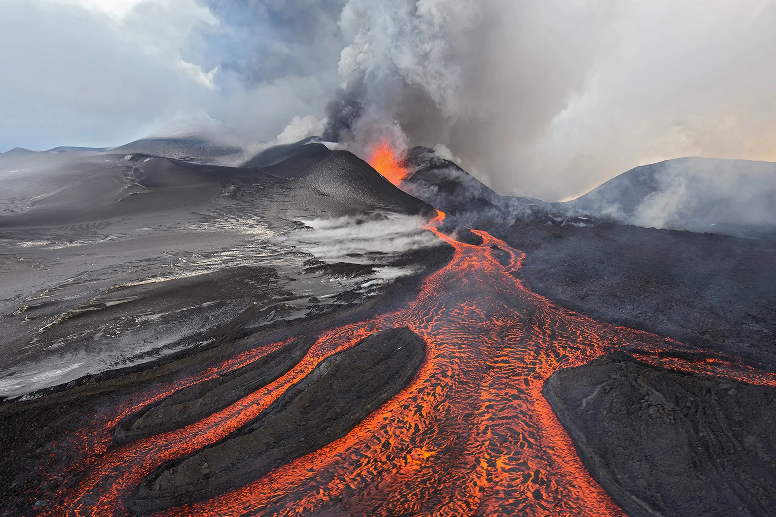
Hi guys I have been tackling the task of creating materials and props for our new level which takes place on a volcano. In my opinion, the most important part of volcanoes is some nice flowing magma.

After searching the internet for a good place to start, We found a great tutorial by Karen Stanley on how to create believable lava with Substance Designer. I recommend downloading her tutorial as it goes into much greater detail than I will on this blog post. Her tutorial has helped me understand what Substance Designer is capable of, leading me to tweak her methods to work well in our game.

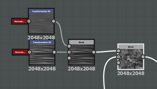
The first step is heavily relies on the blend node. The blend node allows you to overlay one texture over another with functions similar to those found in photoshop like multiply and soft light. Using the plasma texture mixed with a cloud texture gives us a nice base to work with. Adding cracks at this stage is also a good idea as we intend to warp the texture to give it that goopy lava feel.

Once we have a base we can add some horizontal noise to create a cool effect. Through Karen's tutorial we learned this effect is called pahoehoe, or the natural folds and lines that form as flowing lava cools.

The next step is to warp our texture with the Directional Warp node. Blending in more noise helps give options for customizing the texture. It takes a lot of tweaking to get the exact result you'll want.

Running that result through a levels node allows you to tweak the texture further before you run it through a Gradient Map node. The Gradient Map node allows you to create a color gradient that will change our previous result from a black and white image to a fully colored albeto map.

Using the same output we used to create our albeto map, we can blend it with a uniform grey in order to increase or decrease the result of a Height to Normal node.

This was one of my final results in Substance Designer. The next step is to put it in engine.

With the powerful UE4 material editor I was able to get some pretty cool results with the lava. Some of the functions used were a panner to animate the lava, Simple Grass Wind to give its world position offset, a Fresnel to add to the emissive, and the subsurface shading mode to add more depth.

And here's the material! It's still a WIP but I am fairly satisfied with the result. Huge thank you to Karen Stanley again for creating a marvelous tutorial for this sort of thing. Check her stuff out!

Thanks for reading

-Neal Krupa

A Trident For All

Hello,

Well I’ve been busy with some new content that isn’t foliage. Today I was working on texturing a trident that would be used by the cultists and it would also be used in other levels that are still in development. After the model was done I began to look and see what type of metal was used with these weapons as well as the designs on the on the shaft.

So, first things first after I had the high low poly bake it was time to start texturing, I started first with the simple metal on the top of the trident.

After I found a metal I liked I started on edgewear, I started with a mask in substance painter, and began touching it up by hand.

After the edgewear was done I began blending leather materials together to find something that resembled an old worn look.

I then added some finishing touches.

Then I put it in engine to make sure it looked correc.

And there you have it one trident.

If you would like to see more of my work visit my site at https://www.jasonsthomas.net/

Till next week Jason signing off.

Revamping the Waterfall

Hello! In this post we'll go through the process of re-vamping a waterfall mesh and its materials in Unreal blueprint. 

The images below show the original waterfall in game, without materials, and with material in the mesh editor. 

The main issues that needed to be fixed were the hard edges around the waterfall, and although not very noticeable on the picture, the waterfall moved erratically back and forth (in an attempt to break up the edge of the waterfall) instead of falling straight down from gravity. 
The mesh of the waterfall itself was also combined with the mesh of the waterfall pool, which would need to be fixed. 

So! Taking the original mesh back into Maya, I remodeled a slightly higher poly version of both the waterfall and the waterfall pool. For the waterfall pool, instead of making it a complete circle, I modeled it with a curve so that it would fit directly with the waterfall without intersecting it (which could cause hard edges to show). 

The next step is to fix the hard-edges issue, which can be solved with vertex painting. By vertex painting the edges of the meshes, that vertex colour value can be used/masked in the material editor and (in this case) manipulated to control the opacity for the desired effect. 

In this mesh, the red vertex paint is what will be masked for very little opacity, whilst the black vertex paint will remain opaque.

In this mesh, the red vertex paint is what will be masked for very little opacity, whilst the black vertex paint will remain opaque.

In this mesh the reverse will happen. The red vertex paint will be opaque whilst the black edges will lose opacity.

In this mesh the reverse will happen. The red vertex paint will be opaque whilst the black edges will lose opacity.

Within the material editor, this is where the vertex colour is used:

The red vertex colour (this is for the waterfall mesh) is masked to be influenced by the opacity value of the depth fade node. The node is then connected to the opacity in the result node of the material. A parameter (waterDepth) is also used to con…

The red vertex colour (this is for the waterfall mesh) is masked to be influenced by the opacity value of the depth fade node. The node is then connected to the opacity in the result node of the material. A parameter (waterDepth) is also used to control the fade distance and intensity of the opacity level. 

From here on it's simply a case of editing the material editor to create the desired effect. Tessellation values were greatly lowered to reduce the erratic movement of the waterfall. The waterDepth value was edited, and a very small metallic value (0.05) was added. The original panning texture was edited as well as the base colours of the waterfall. Below was the final material editor (most of the original material was able to remain the same):

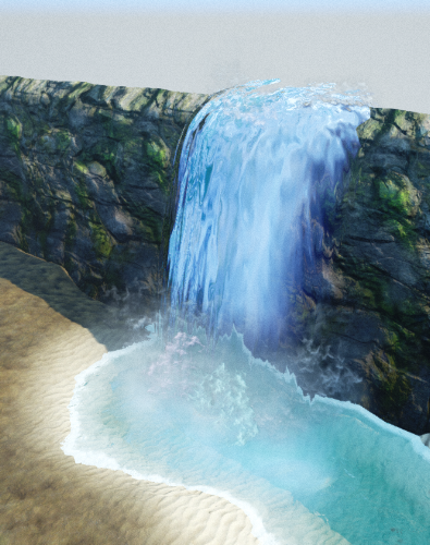
Here was the final result (without particles):

Now the final result with particles! 

Thanks for reading! Until next time.

For more of my work visit http://eflusin.wix.com/portfolio

Texturing the Cultist

The cultist in our game is a fanatic of Poseidon. They are humans that live on the island of Sicily, or come as pilgrims to ascend the volcano on which their god's temple sits. The player encounters them in two areas, the path right before the forest, and at the temple steps. The decisions we made around this character were based on grimey pagan characters, that have caked themselves in mud and paint in worship, and are trying to take Kyon's herd to sacrifice in order to Honor Poseidon.  

The main challenge here was getting the cracking to look right. Something that is incredibly important when texturing and creating models are layers. Not substance layers either, but physical layering of material on material. Being able to see a change in surface and material is incredibly important to the quality of a character. This version is at 4K for demonstration purposes to show the craftsmanship of the textures, and to give some incite into substance painter.

I like to start by painting the base coat in zbrush, I feel like I have more blending control than in substance for skin, and the "mask by______" options are excellent for creating pore details and other such details. 

The first thing to notice is that the base color map does NOT look good in substance, even at 4K it still cannot maintain the detail from the polypaint. This is just the nature of baking that not all details will be saved, but as discouraging as this model looks, it will eventually turn out gorgeously. Let's take a look at some quick processes:

I like to keep my base color map in a fill layer all to itself, thanks to layers in Substance Painter, I can work non-destructively and safely, while preserving my original texture. Another key instance that we are going to talk about is Specularity and Roughness, two of the most important maps for characters.

As you can see from this chart, roughness is a  black and white scale from most wet to most dry,  while specularity controls the shine of an object. It is definitely  true that these maps are important for any object, but what makes it so great for characters is that have good spec and rough controls allows to really accent pore and wrinkle details on your characters. This is where automask control in Zbrush comes in handy.

The auto mask features will generate a mask based on certain precomputed parameters and create a mask across the surface of an object. My personal favorites are Mask by Cavity, Smoothness, and Peaks and Valleys. The results of these, if your surface details are good enough will result in masks such as this.

This can be a fairly effective spec map because of the pore highlights being shown off here, Let's take a look at it in substance now in addition to a roughness map generated in the same fashion.  (By the way this was created with mask by cavities.)

Now we're getting somewhere, the spec and rough are extremes so that we can set up parameters in Unreal to change how drastic we want each map to be. Moving forward it's time for the fun part; mud, and dirt.

This character is dirty, and I mean really dirty but if we just slap a whole bunch of mud on him that won't look good so we have to plan things out. This is where layering comes in. Dry mud, looks significantly different from wet mud.

The difference is stark, keep in mind that your mud should look like it's from the same general region, they're cultist fanatics, not frequent flyers. Try to keep the dry and wet areas looking like they're still from the same mud. 

I grew up playing Warhammer 40k and painting models as a kid, so I almost always end up thinking in basecoats, highlights and fills when I'm texturing. Normally this would be considered odd when working in pbr considering the lighting is supposed to take care of highlights, however this still applies from a compositional standpoint, I would call our albedo or base color map, our base coat, and now we are going to add our first fill, a quick coat of dry mud and dust, with a simple dirt generator. I keep the roughness and spec low in this area, mostly because it give a sort of look like  it's protecting his skin from the sun similar to elephants and rhinos. It helps give him character and surface change which ties into our needs for layering as mentioned earlier. Naturally you will also want a subtle normal map to signify the difference of skin to mud. Let's take a look:

As you can see, its really weird around the face, but we aren't worried about those areas right now, because we are still applying our base coats and fill layers to the model, soon we will get to the areas we want to attract the most attention. Now that we have our fill we need to make it look good, because right now it's hard to say that this will actually be of any use to us. This is where we get to the most powerful tools in substance, hand painted masks. With this we can use particle brushes and scattering dust and earth alphas to rip away at the mud and dirt creating serious and noticeable surface changes, this will look way more natural than just slapping a generator on something, and it'll be way more appealing in your own work. 

Now it's time to get to the face paint, In my opinion this was the hardest part of the texturing process because it can look wrong very easily, again this is the great power of layers in substance and photoshop is that testing textures becomes incredibly fast, easy, and most importantly; SAFE! Polypaint is very destructive and can lead to restarts more often than not, so being able to separate textures into individual layers becomes an invaluable tool, the first thing I did was grab some textures online and comp them together until I had three maps, a normal, a mask, and an albedo. We will hand paint the rough and spec maps for optimal control.

So the good things about this map is that we have some good variation in cracks, scale and harshness. This will look pretty cool when all is said and done, the variation in mask intensity will help make it look mushed on as well because it's not like they are constantly retouching their face over and over again. Let's take a look at this first result on the model.

So ignoring the tiling, since we will severely edit this with painted masks, the actual cracking looks ok. It's very hard to tell currently so let's move on to the next step

Now we can see an accurate look at the paint! Granted if we were going to use height maps we could get some incredibly beautiful results but for now I think this looks great and I want to move on to our final steps. Wet mud.

The wet and dark mud allows for a few things; it justifies a gradient over the body, which for a topdown game adds a lot of character depth. However, since we are driving this gradient with dirt, we can still stay dedicated to true PBR texturing. The other thing it does is give the character some straight up wetness, which adds a lot of difference to the character.

And this is the Result! Now from here the work is definitely not over, we have to now to material work to add subsurface scattering, and other cool effects on this guy, but for now we still have an awesome dirty cultist ready to sacrifice sheep to Poseidon!


Thanks for reading, and if you want to see more character art please visit my website by clicking the link down below!

Core Mechanics: Herding Sheep and Having Fun Doing It

When we first began developing this game, the first and most important aspect of the game that was examined was the player's core mechanic: sheep herding. While there have been a number of video games in the past that focus on guiding friendly AI through treacherous environments, we could find very few non-strategy titles that centered on mob behavior controlled with passive  player guidance. This made the design process difficult, as I had few examples to draw from. Designing, refining, and implementing the core herding mechanic required a great deal of attention and care.


Player Movement

The first step was determining how the player would move and interact with the world. We had already settled that the game would have a top down third person view with the most minimal UI possible. A key part of this was sticking strictly to what a dog would be capable of. What can Kyon do, and what can he not do?

The player moves freely in a 360 degree range and can sprint short distances. The player's movement had to be as smooth as possible with the joystick on a gamepad, because the player's steering affects the herd's steering. 


Corralling Sheep

Next, I had to determine how the player interacts with the sheep. Any time the player comes across a lone sheep, they can have that sheep join the herd by touching the sheep.
 

Originally, we had an invisible AI herd actor that was repelled from the player, and the sheep would continuously follow that invisible actor. This allowed the sheep to always move in the opposite direction of the player. This, unfortunately, created issues with sheep jamming up on each other trying to get to the herd actor, could cause issues if the sheep somehow were separated from the herd actor, and reduced the player's ability to quickly visually understand where the flock's center of gravity and direction of movement is.
 

Herding Sheep

Instead, we introduced Horatio, a ram with golden fleece that guides the herd. This served to give the player a much better visual understanding of where the herd is going, and also reduced the amount of sheep pileups that occurred. Again, making sure the player feels like they are in control of not only their character, but also the flock has been the top design priority for this game.
 

Bark Commands

The player uses two bark commands to control the flock: a stop bark and a go bark. The stop bark has Horatio immediately stop moving if within range, thus the flock stops. If the player uses the go bark after this, Horatio will resume his normal behavior. If the sheep haven't been ordered to stop, the go bark will make them briefly move much faster.


Picking Up Sheep

The player has the ability to pick up and carry sheep if they so choose. This is useful for getting trapped sheep, stray sheep taking too long to get to the flock, or fixing traffic jams.


Each of these core mechanics went through multiple iterations, which allowed Chris and me to refine interaction between the player and the sheep. To me, this was the most important factor of the game. The herding system is relatively novel, and being the core mechanic of the entire game meant that it had to immediately be enjoyable to navigate the world and guide the sheep. It wouldn't matter about how good any other aspect of this game was. If the herding mechanics don't feel responsive or enjoyable to the player, the game is a failure. Fortunately, we have been receiving very positive feedback from playtesters indicating that they enjoy the herding mechanics. However, there's always more to refine and improve and we will continue to work on it. 


Jack Lipoff

Product Owner
Lead Designer

Taking Flight

When Jack and Jon came to me with a design for a flying enemy, I was actually quite confident in my ability to create flying AI. Unreal 4's movement component had a flying section, and keeping to the navigation mesh (Navmesh) used by all the other AI would be no problem. Except the flying movement for characters has not be given the ability to follow the navmesh yet, and we need this enemy (the Manticore) to fly over, not around, obstacles.


manticoreBPview.jpg

Whenever we create a new AI actor, first we setup the character and file structure. This insures that anyone who needs the actor is able to quickly get in and pull the actor out for testing or set dressing.

The challenge for this character compared to our others lay in the need for this character to NOT follow the navmesh. For this purpose, I began to think of how to disable the need for navmesh. When I asked Jack and Jon again about it, they told me that the manticore never really needed walk on the ground. This made my job a lot easier, as I was able to completely disable its character movement in favor of a system of target points.

As the manticore approaches its target points, it will randomly pick another target and interpolate its forward vector towards the new point. This gives the actor a nice curve whenever it turns, and will look much better when it is given its animations.


Though it's flying, we still have a ways to go until it is game ready. Next on the list: implement sheep targeting behavior and I am looking into getting it to fetch coffee in the mornings.

Christopher Miller

Lead Programmer

Need More Plants

The most important part to a successful environment is making it feel alive. And when it comes to an outdoor environment foliage is the keystone in making things feel alive.

Being that Kyon is a game that takes place almost entirely outside we rely heavily on foliage to flesh out our scenes. I have used SpeedTree to create all of the foliage throughout our game. Every level is filled with thousands of instances of foliage ranging from grass and flowers to trees and shrubs. However, I felt our environments were lacking the ground foliage they deserved.

I started by finding references of different ground plants until I had a rough idea of what I wanted to do.

02e6ff62fe5bf2a3a790ca7bb4382086.png

Once I was ready I found a good leaf texture on megascans.se  and used SpeedTree's generate mesh tool to create a leaf mesh. While the generate mesh tool is fast and convenient, most of the time I will create a leaf mesh with Autodesk Maya and import it for use in SpeedTree.

After creating the leaf mesh, I use the generator options to create stems and leaves. I then adjust the various attributes and manually tweak the different meshes' positions to get the plant looking the way I want.

After applying the textures I use the wind tool to add more life to the plant.

I appreciate you reading and hope you continue to follow the development of Kyon. If you want to see more of my stuff you can find my website at:

The wild manticore!

This week has been quite the challenge, After polishing up a few rigs I had to tackle the challenge of  rigging a manticore! Our version of this dangerous mythical beast is part lion, scorpion, bat  and it even has some razor sharp talons on its hind legs. I would show you guys this beastly character but I think it be cooler to unveil the manticore once we get some of his animations ready. I will say though that rigging the manticore was quite the challenge, the wings especially. Hopefully we can show you this beast soon but if not then maybe one of our other monster!

Modeling foliage in Maya

Within the game, foliage plays a big role in the environment, it’s a key indicator of the passing of time, as well as it makes the environment much more flush and full. What I’ve done today was create a few assets that add to the environment, these are falling tree assets these assets will be used as obstacles for players to avoid. For example, one tree will shake and act as if it is about to fall, and once a player gets close to said actor in engine it will fall damaging the player or if it lands on sheep causing mass death within the herd. Going about creating the falling tree assets was different for me because I haven’t made multiple types of foliage before, but hey I must learn some time. After multiple attempts of trying to use a cylinder primitive and not getting anything that looked decent I decided to use a CV curve to make a base that I would extrude off from and it looked good for what I needed.  I repeated this process for the branches and used planes for the leaves, once done I UV’d the branches and tree base and now I am currently texturing the trees in substance painter 2. Here are some screenshots of my current progress.

If you would like to see more of my work please visit my site at jasonsthomas.net.

Signing off Environment artist 

Jason Thomas.

Modeling and Texturing Greek Pottery

Greek pottery will be scattered throughout the environment to add a storytelling element in the game. The first step is research and references.

References

References

The next step is to begin modeling. Using Maya I first created very low poly models in order to establish a clean, optimized topology. Then the polycount was increased in order to attain the smoothness desired for the pottery. Once the model is finished and the UVs are laid out, it is imported into Substance Painter to texture. The base paint is applied and then cracks, dirt and wear and tear are added.

Low and Higher Poly Base Pelike Model + Wireframe

Low and Higher Poly Base Pelike Model + Wireframe

Textured Pelike

Textured Pelike

Low and Higher Poly Base Kanthoros Models + Wireframe

Low and Higher Poly Base Kanthoros Models + Wireframe

Textured Kanthoros

Textured Kanthoros

Low and Higher Poly Base Amphora Model + Wireframe

Low and Higher Poly Base Amphora Model + Wireframe

Textured Amphora

Textured Amphora

Low and Higher Poly Base Oinochoe Model + Wireframe

Low and Higher Poly Base Oinochoe Model + Wireframe

Textured Oinochoe

Textured Oinochoe

Low and Higher Poly Base Lekythos Model + Wireframe

Low and Higher Poly Base Lekythos Model + Wireframe

Textured Lekythos

Textured Lekythos

Thank you for reading, for more of my work you can visit my website at:
http://eflusin.wix.com/portfolio

Subsurface Scattering Material for Characters

As part of the Character art responsibilities I also work on researching technical requirements for making good looking characters in game. The first are the basic maps required; your Albido or Diffuse  map, Roughness Normal Map, and Specular maps are all important for characters. How you make these maps is up to you but for this we are going full PBR. It's all well and good to just plug these maps in however characters suffer from something that other objects don't; they need to look alive. In short, blood needs to be running through the body, or in our case it needs to LOOK like it's running through the body. That is where Subsurface Scattering comes in.

First let's define what exactly Subsurface Scattering (SSS) is. SSS  is a mechanism where light penetrates the surface of an object and gets scattered by interacting with  the material and exits through the surface at a new point. In the case of humans, light goes through the skin and interacts with the subdermal layer of the skin and illuminates it while passing through creating a very noticeable highlight in areas like the ear and the nose cartilage.

Here we can see some examples of SSS in the real world from movies and photos. As you can see it's very noticeable in the Ears and the hands. This makes it even more pertinent that subsurface looks good in game, because the hands and face are the most expressive parts of the human and thus, the first place we look at to gauge a character's realism.

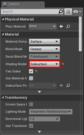
Unreal Engine 4 has several different shading models for Subsurface Scattering. For our model we are going to use the Subsurface shading mode.

Subsurface Shading Model

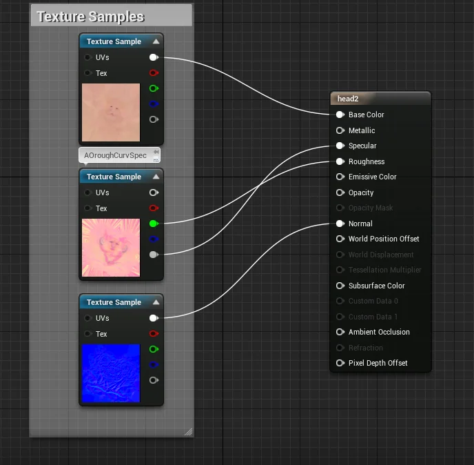
Next is Plugging in our Albido, Normal, Spec, and Roughness. I like to pack my grayscale maps into one texture to save space, but you can do what you want with your own model. 

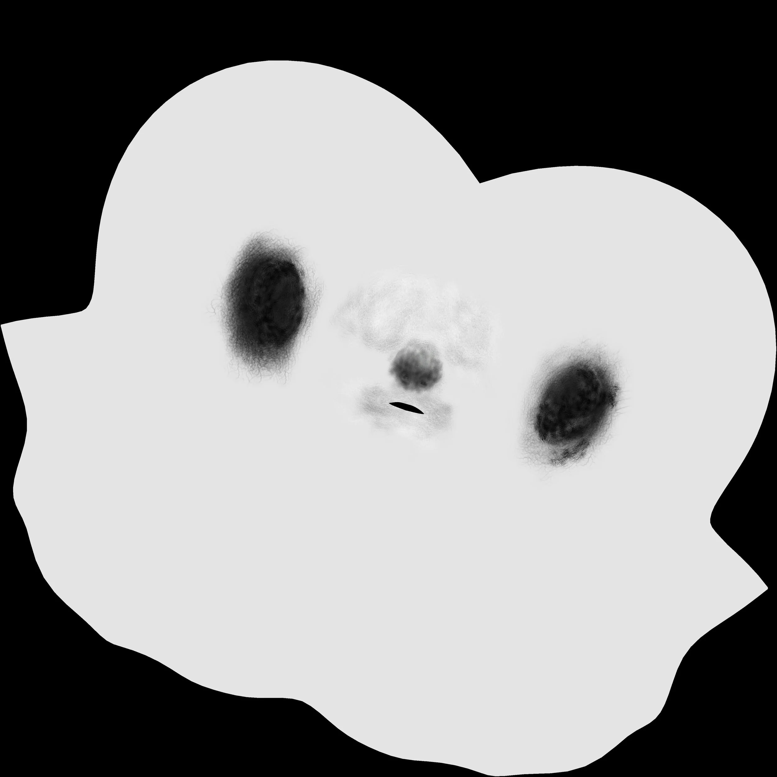
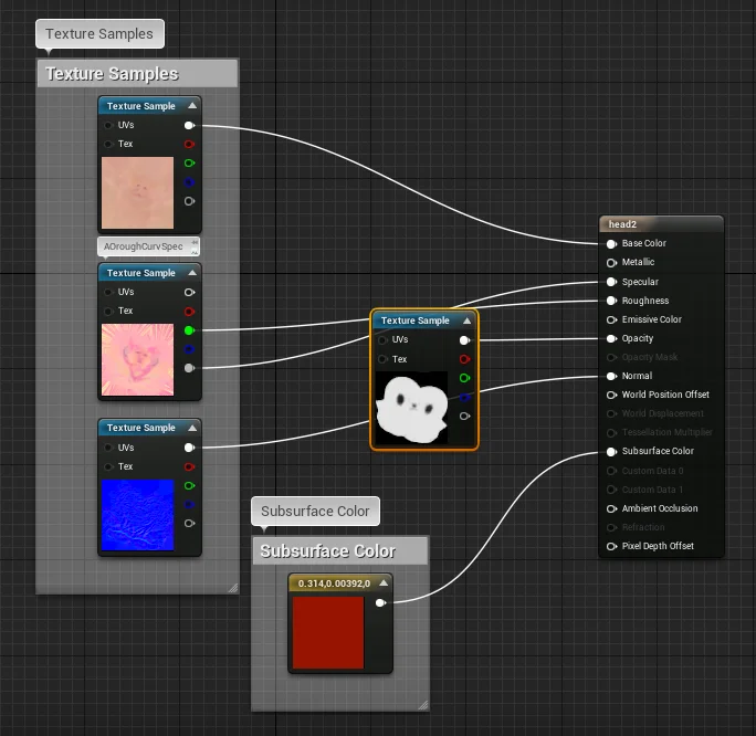
Once these are plugged in we can take a look at the Material Result node. We can see that with the subsurface shading model open, there are two new pins available to us; opacity and subsurface color. The opacity map is a grayscale map where black allows the most light to pass through, and white allows no light to pass through. An example of this map would  look like this.

SSS.jpg

Pay close attention to the ears and the nose. These are the most important parts of the face for SSS so we can make them full black for now. A more detailed sss map could include variations of grey in the nose and ear area but right now we are looking mostly for effect. Go ahead now and plug your opacity map into the opacity pin. If you  don't have one or can't make it, you can use your Ambient occlusion map.

After we plug in our mask we can see some of the changes to the body. We have a three point lighting solution set  up and we can clearly see backscatter which is great. However there are some very clear and present issues. First is the most obvious which is our diffuse map has been completely washed out, the second is the nose opacity is way to harsh, to the point where you can see it even with no direct scatter.

After the revisions you can see that we faded the nose more delicately and the new result is way more desireable.

So, we now have a desireable mask, however we still have the very bad pale look going on that we need to fix. The main reason for this is that we have no color plugged into our subsurface color.

After plugging in our subsurface we can start to see  some better results from our material.

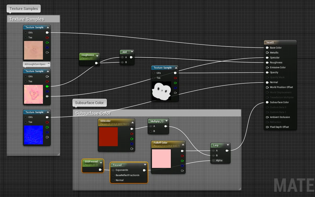
Now we are starting to get somewhere, however there are still some issues, he's too red and the backscatter is orange. this is mostly to do with a lack of gradation, and no proper illumination or rim that occurs on good SSS. In order to get this effect we need a few things. A multiply, a fresnel, and a second color node. The reason for  the multiply node is so that we can manipulate the amount of illumination that is actually happening in the SSS color. As default we can set this to 1 so that nothing is changing but it is always good to keep options open with a scalar parameter. The falloff color can is what we use to create the highlight rim that appears so vibrantly in real life. In order to blend these to we can lerp them together and check the result.

So we are getting a better skin tone but now our color in our backscatter is gone, this is because we have a perfect blend right now, and we need some kind of alpha to create the rim around the head.

I made a scalar parameter for the Fresnel exponent so that I could play around with the size. For default I made it 0.1. Now let's take a look at the final result!

Thanks for reading this post if you want to see more work  like this visit my portfolio website; http://jongilboa.wixsite.com/grumpfrog


Jonathan Gilboa

Art director and Character Artist

Rigging the Cyclops

Hi, today's task was getting Polyphemus rigged! Luckily at Sheeple we use the Rapid Rig: Modular script to help speed up the rigging process for all our rigs. Here is a photo of Polyphemus with the biped preset rig after placing the proxy rig. The plugin makes the process simple and fast. Next step Modification and Skin weighting! 

Remi GardazEnvironment Artist/ Rigger

Remi Gardaz

Environment Artist/ Rigger